HTML5 Developer Conference
by Brandon Cole
This week, I was lucky to be able to attend the HTML5 Developer Conference in San Francisco. Here’s a few takeaways that I’d like to share!
Module Based Design
This was probably my favorite talk of the day. It focused on best practices for design of modern web applications and utilizing reusable components.
The full talk is titled Evolving Web Applications with Module Based Design Components and was given by Mike Kivikoski, a Designer and Developer at Cantina in Boston.
He started out with some examples of good module based design, like Netflix. Netflix has a standardized widget to display a list of TV shows or movies, and it is reused in multiple places across the site. The important thing to note is the consistency.
However, it is not enough to simply have a consistent UI. It should also be maintainable.
He gave an example of an airline site which he enjoyed using. The buttons and styles were consistent. However, he looked into the source code and noticed that different classes were being used for titles that had the same exact styling. This is bad! It means that if a change wants to be made (ex: change the title font size), this has to be changed in every CSS class used by titles. This violates the DRY principle (don’t repeat yourself!), and it’s not maintainable!
He ended with an example of an even worse site, where there wasn’t even consistency. Buttons looked different, forms had different styling, and so on. This is an obvious no-no.
But back to the good design. What should we do?
Good Design - Tips & Tricks
Mike gave a lot of tips & tricks in this talk to keep in mind while designing your CSS and website. I’ll pull out a few that I especially thought were useful.
1) Use CSS classes, not IDs
Classes are reusable, and this approach helps promote a component based design and dissuades styling for “one-off’s” (more on this later).
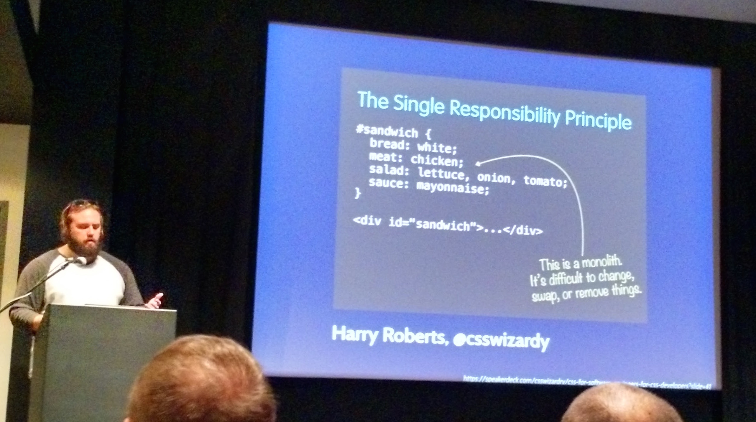
2) CSS classes should do one thing and do it well
Creating monolith classes that do everything you need in one shot may seem simple at first, but it’s not a good approach. Again, this will impede our desire to have reusable CSS classes.
As an example, consider a sandwich. It would be poor design to just create a sandwich style, as this isn’t very reusable.

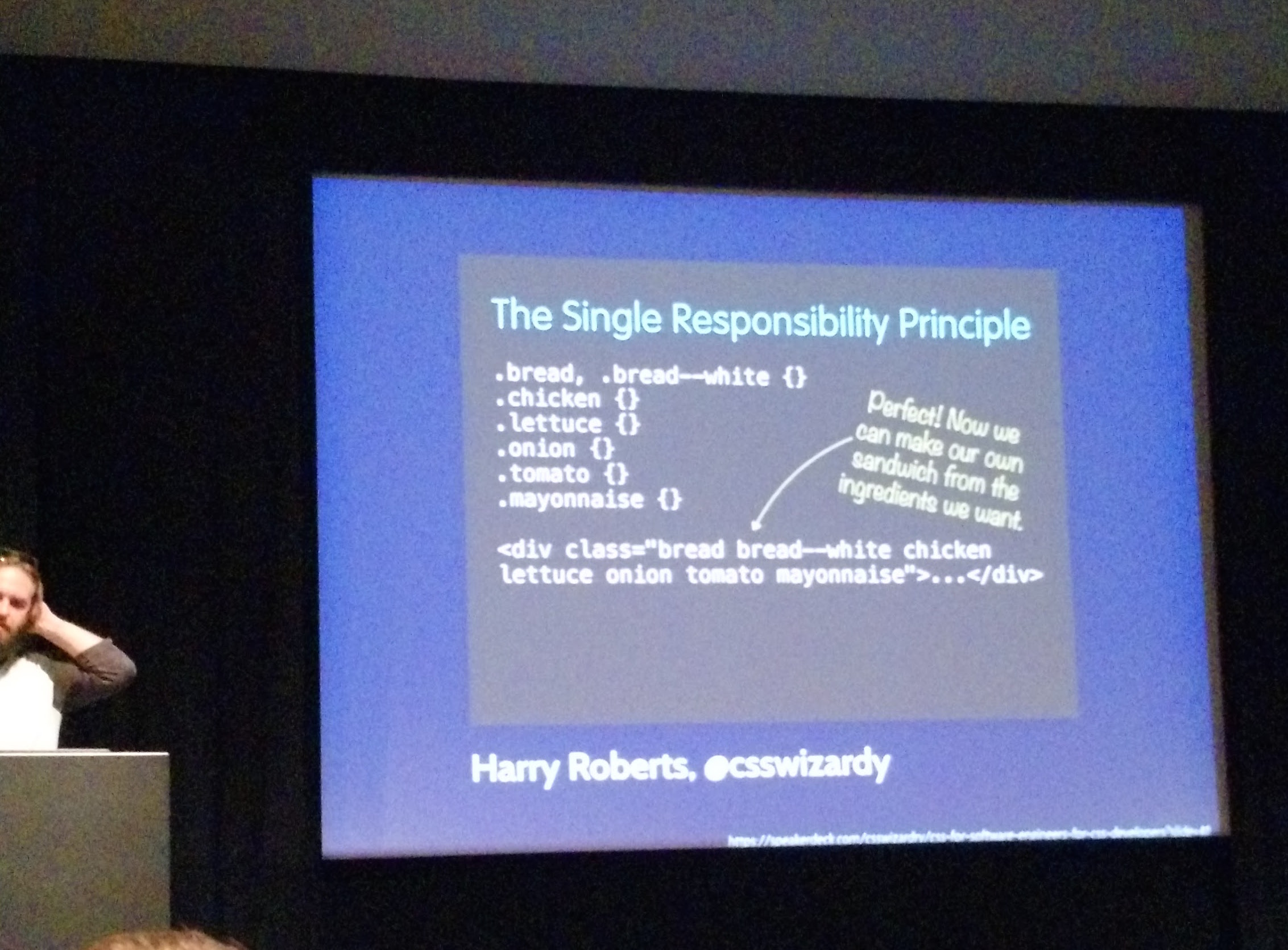
Instead, we want smaller components that are responsible for one piece of the design. They should do one thing, and do it well!
Here’s a better approach:

If you think about it, this isn’t really anything brand-new for software design. Cohesive design is a practice across all software development. However, I think it can be overlooked when it comes to CSS design. I hadn’t really given this idea too much thought before Mike’s talk.
3) Don’t make one-off changes
When marketing comes with a new requirement, don’t create the CSS class .headline-one-with-top-margin-for-marketing. Create components!
.headline-one, .top-margin, and .marketing (if required) are the classes you should create instead.
This is really just another reiteration of following the DRY principle and will make for a maintainable design.
4) Use variables, and name variables appropriately
A good example is colors; don’t hardcode color values in your classes. And when assigning colors to a variable, take care to name the variable appropriately.
@gray, @dark-gray, @extra-dark-gray, @super-extra-dark-gray, and so on.. is unrealistic. Use a number scheme instead.
@gray-100, @gray-200, @gray-300, …, @gray-900, this is a much better approach (and follows the font-weight standard).
You could also do this for colors that you don’t want to explicitly name. Example: @primary-100, @primary-200, @primary-300, and so on for your primary theme color.
5) CSS file organization
CSS files should be named according to component, not based on the page!
Bad example:
.
├── styles
|   ├── homePage.css
|   ├── aboutPage.css
|   ├── contactPage.css
|   ├── ...
Good example:
.
├── styles
|   ├── alerts.css
|   ├── buttons.css
|   ├── forms.css
|   ├── ...
This will help enforce that reusable component based design that we’ve been talking about. Organizing based on location makes it much harder to reuse that style in another part of the site.
6) Code Reviews
Mike finished off the talk with tips on how to be more successful as a team.
Code reviews are a must, even for styles. A few things this can help with:
- Check that variables are used (appropriately).
- Check syntax, and check that naming standards are used and code is consistent.
- Check that components are reusable.
7) Style Guides
Documentation is normally not the most enjoyed part of a developer’s life, but it is crucial!
In the case of module based design, it can clearly show the rest of your team the components that are available for use.
There are plenty of tools that will help generate these style guides for you:
- KSS
- Pattern Lab
- Fabricator - and here’s a demo of a style guide
He also mentions not to let this style guide die. Keep it up-to-date and let it evolve!
One final topic I want to discuss on this talk is testing. I had a concern while hearing this talk that by putting styles into reused classes, testing could become a pain. If you want to change the style of some text on the homepage, you go and change the style. But then what if that style is reused, and some other page breaks?
Apparently, I wasn’t the only one with that concern, as it was brought up during Q&A. Mike’s answer was two-fold. First, he admitted that of course some regression testing will have to be done to ensure that the change isn’t breaking other parts of the site. The other point he brought up is that the benefit of this module based design is that components “play well” together. Components should be compatible with other components (without breaking).
In other words, it shouldn’t be possible that changing a component’s style and testing it on the homepage would work, but would break on another part of the site. This all relates back to his point about avoiding one-off changes as well, as you can better prevent odd edge cases that happen only on certain pages.
So, take that with a grain of salt. A perfect implementation of module based design wouldn’t introduce this sort of bug, but things don’t always execute perfectly, do they? ;)
This was a very potent talk with a lot of content, but I hope I summarized out the core points on this one!
Localization
I actually had no idea what this talk would be about, based on it’s title: How Automation Can Open Up Your Product to a Billion More Users*. The asterisk ended up signifying:
* if you localize all the languages …
The full slide deck is available here: https://eleith.com/slides/automate-i18n/
Some of the core points I took out of this talk:
1) How to determine the user’s language
This can be difficult, and depends on the specific situation. In general, use a combination of strategies:
- User’s preference data (if the user is logged in).
- The
Accept-Languageheader in the request (this is based on browser preferences). - IP-based (using a service like MaxMind).
Google was given as an example of a good experience. You can travel to Japan, the site would load in Japanese, but Google would offer a message saying “we think you might prefer to read this in English.”
2) How to broadcast the language support
This is important to help ensure that user is given appropriate content. It can also help search engines pick the right results.
Use the HTML standard (<html lang="en">) or use subdomains:
- es.coursera.org
- zh.coursera.org
- pt.coursera.org
3) Translation concerns
There’s more to consider than simply translating words. For example, the English word “back” could be translated to the meaning “previous”, or to the part of the human body. Context is important.
Format can also change. For example, dates, times and numbers (like the thousands separator), may all need to be presented in different ways depending on the locale.
Solving this depends on the importance of quality. Automated translation services, like Google Translate, are improving over time. But they still aren’t perfect. If high quality translation content is necessary, it might be more appropriate to use a more manual process.
Human translators can recognize context better. You can use outsourcing sites like Amazon’s Mechanical Turk for this.
4) Not all site content should be translated
Care needs to be taken to not simply translate the entire website. Certain content, such as URLs or code snippets, should often not be translated.
The approach suggested in this talk solved this by abstracting strings out. Then, at the presentation level, strings were wrapped with a Javascript _t(string) function call that took care of the translation. This forces the translation to be more explicit.
Note: the _t() function is specific to the custom translation library Coursera created. View the slide deck for more information on their approach.
Localization is important on the internet. Simply looking at English vs non-English speakers on the internet shows this importance.

Drunk User Testing
This was definitely one of the most fun talks of the day! But before you get too excited - No, we didn’t get drunk for this one :(
The idea behind this type of testing is that (1) your site is simple enough that a drunk user can use it, and (2) drunk users will give more honest feedback.
There’s actually a website called theuserisdrunk.com, where a UX professional says he will get drunk and test your website while recording the session and providing a full feedback document.
Austin Knight was the presenter for this talk, and he works for HubSpot. HubSpot used this service on their homepage and got some valuable feedback. The screencast video is recorded below - it’s actually quite an entertaining video if you have some time!
Austin spent the rest of the talk discussing the possibility of user testing with sober users.
Challenges
There are challenges to consider when setting up user tests. Often times during user testing, users will give opinions even if they wouldn’t normally have one. They end up thinking of an opinion to give instead of fully using the product. This is unnatural. In addition, feedback can be skewed if questions are leading.
Solutions
1) Segment your users
Ask “qualifying questions” that help you ensure that your users who you are testing are in fact your target audience.
2) Iterate the tests
Start with a pilot test that will “test the test.” This will let you identify any flaws in the test before running it against actual users.
Then run tests in iterations. Each iteration really only needs 3-5 users, according to Austin. Continue this iteration cycle.
3) Don’t lead the user
It is important to ask questions that don’t exactly match the implementation.
Consider these two prompts. Which is the better phrasing?
- “Find the job application form and submit it”
- “Find a job you like and apply for it”
The first prompt leads the user by referring to specific implementation terminology (a “form”, a “submit” button). Asking for behavior is preferred, and will help induce a more natural environment.
4) Create a culture of UX at your company
Everyone is a UX designer. There should be a sense of ownership from everyone, and the mindset of “oh, it’s that guy’s fault, not mine” shouldn’t exist.
By following these tips, it is possible to get valuable feedback from every user (not just drunk ones)!
Subscribe via RSS
